In the digital age, trust is the most valuable currency. When designing Barakah, our goal was to move beyond the traditional "Donate" button and create an ecosystem where donors could see, feel, and track the real-world impact of their contributions.
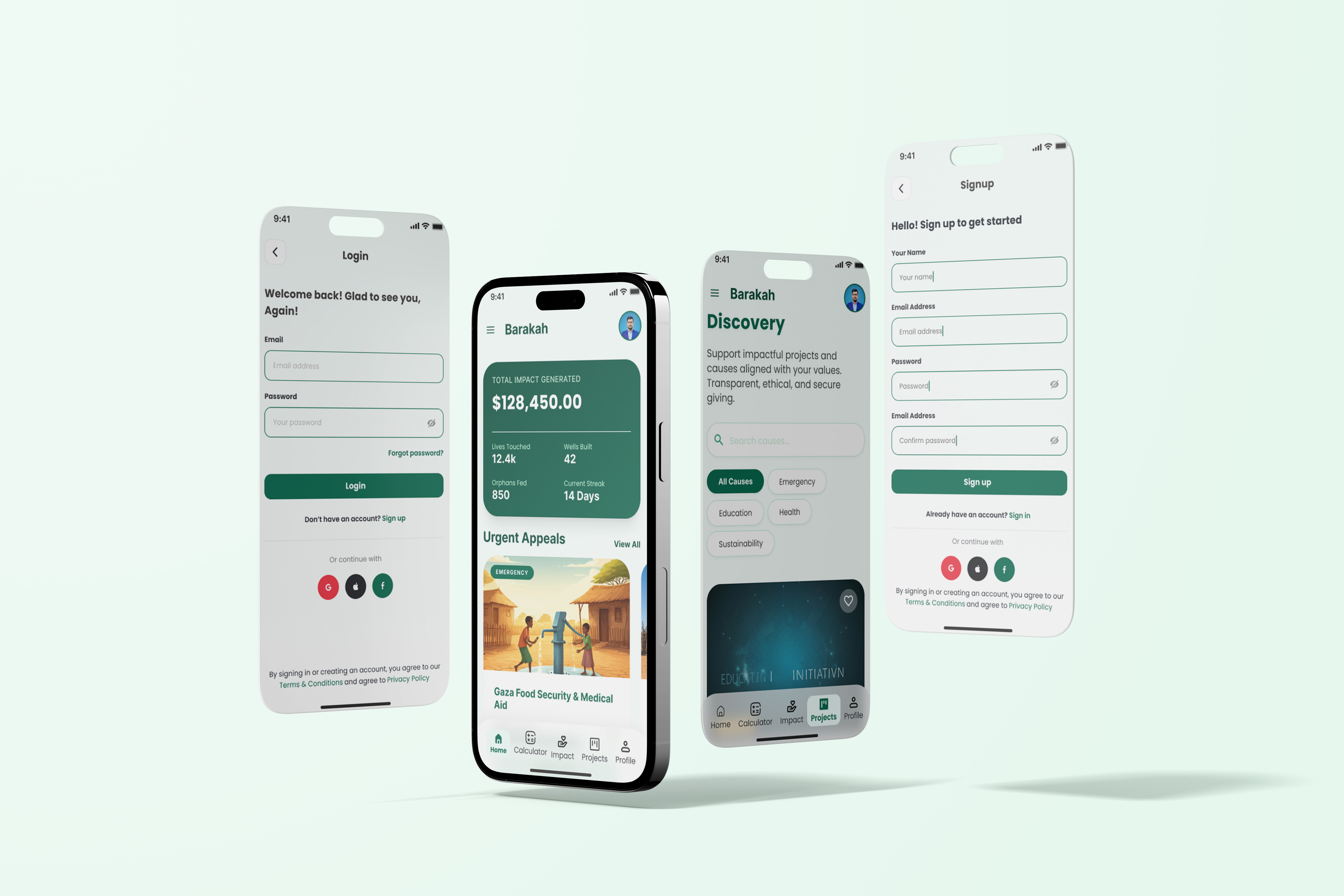
1. The Power of Visual Transparency We used a "Data-First" dashboard that instantly shows a user's total impact. By breaking down contributions into tangible metrics—like "Wells Built" or "Orphans Fed"—the user moves from being a one-time donor to an active participant in a global mission.
2. Color Psychology: The "Deep Forest" Palette. For Barakah, we chose a sophisticated dark green palette. In design psychology, green represents growth, stability, and peace. This builds an immediate sense of ethical reliability, which is crucial for any platform handling financial transactions for social good.
3. Frictionless Onboarding As seen in our login and signup flows, we prioritized "Minimalist Friction." By reducing the steps needed to get into the app, we decrease user drop-off. A smooth entry point ensures that the focus remains on the "Discovery" of new projects that need support.
4. Mobile-First Card Architecture The app uses a modular card system. This makes complex information (like emergency medical aid appeals) easy to digest at a glance. It also ensures the app remains 100% responsive and accessible across all devices.
At Rackup IT, we believe that design isn't just about how things look; it’s about how they work to solve real-world problems. Barakah is a testament to that belief.